
Systems, Not Screens
Tokens and components, so page fifty looks like page one without anyone policing it.
UI design is the visual layer — type scale, color, spacing, components, and every state each component can be in. Designed as a system it stays consistent as the product grows. Designed screen by screen it drifts within a quarter. The structural half is UX design; this is what makes it look like you.
A design that looks excellent in a presentation and falls apart in the build is a specification problem, not a taste problem.
Tokens and components, so page fifty looks like page one without anyone policing it.
Hover, focus, disabled, loading, error, empty. The states nobody designs are the ones developers invent.
Color decisions validated against contrast requirements before they reach the build.
Designed against your actual copy and data, not placeholder text that always happens to fit.
Tokens, specs and behavior documented — not a flat file and a color picker.
Interface work has a large checkable surface. These are run before handover, and they are the difference between a design that survives implementation and one that does not.
These are interface checks. Any statement about conversion or engagement would need measurement in your analytics after launch; we make none here.
Four layers, built in order. Start at the top and the system underneath never gets built.
Discuss a Project →Type scale, color, spacing, radius, elevation.
Buttons, inputs, cards — and all their states.
How components combine into recurring layouts.
Real screens assembled from the layers above.
A working visual system, plus the screens that prove it works.
Type scale, color palette with contrast validated, spacing scale, corner radii and elevation — defined as tokens so they can be implemented rather than eyeballed.
Buttons, forms, cards, navigation, tables and modals, each designed in every state they will actually appear in.
How each component and layout adapts across breakpoints, specified rather than left for the developer to interpret.
Transitions and micro-interactions where they aid comprehension, with reduced-motion behavior defined alongside.
Key screens assembled from the system using real content, which is where a system either proves itself or reveals its gaps.
Contrast ratios, focus indicators, target sizes and text scaling checked as part of design rather than audited after launch.
Variables named and exported so the front end implements the system rather than approximating it.
When to use each component, what not to do, and how to extend the system without breaking it.
A UI system is only worth what the build preserves. Ours are specified for implementation and the [web development](/services/web-development/) work is briefed from the same tokens.
A marketing page and an internal dashboard are both user interfaces and almost nothing about designing them is the same.
Persuasion and hierarchy. Generous spacing, few actions, and a clear route through the argument.
Information per screen matters. Tighter density, restrained decoration, and typography doing the structural work.
Where clarity and error handling are the whole design, and visual flourish gets in the way of accuracy.
Where the risk is showing everything equally. Hierarchy has to reflect what actually needs attention.
Interfaces where each choice changes what follows, and keeping the current state legible is the hard part.
Where the job is to get out of the way. Measure, line height and contrast carry more than any component does.
Foundations, then components, then pages — the reverse of how most projects start.
What exists, what the brand requires, and where the current interface is inconsistent. Established through review rather than a mood board.
Type, color, spacing and elevation defined as tokens. Every later decision inherits from these, so they get settled first.
Each component designed with all of its states. This is where most of the real work is, and where most projects under-invest.
Key screens built from the system with real content. Gaps in the system surface here, and get fixed here.
Tokens exported, behavior documented, and questions answered during the build rather than after it.
UI work is the right answer when the structure is sound. When it is not, it is expensive decoration.
The flow is right and the surface undermines confidence in it. The clearest case for interface work.
New pages and features arriving regularly, each one currently designed from scratch. A system pays for itself quickly.
Sections built at different times by different people, now visibly not one product.
The moment a system is most valuable, because it can be implemented once as components rather than retrofitted.
If people cannot complete the task, styling will not help. That is UX design, and it comes first.
Interfaces do not usually get inconsistent through bad decisions. They get inconsistent through a hundred reasonable ones made without a system.
A design system is a set of shared foundations and components with rules for using them — not just a component library, but the decisions about type, spacing, color and behavior that everything else inherits from.
You need one if more than one person will make design decisions, or if the product will keep growing. Below that threshold — a small brochure site designed once by one person — a system is overhead you may not recover.
The signal that you needed one and did not build it is recognizable: four button styles, three shades of the same gray, spacing that varies by a few pixels between similar sections, and nobody able to say which version is correct.
Almost always because states and edge cases were not designed, so the developer made reasonable guesses. A design file typically shows the ideal case: perfect content length, no errors, nothing loading, nothing empty.
Real interfaces spend a lot of time in the other states. A button being pressed, a form field in error, a list with nothing in it, a name three times longer than the placeholder. If those were not designed, they were decided in code.
The other cause is values rather than states. A design with spacing that varies arbitrarily gives a developer nothing to implement, so they build to a grid — and the result is close to the design without matching it. Tokens fix that by making the values explicit.
Through clarity and speed rather than through beauty. Interfaces convert better when the next action is obvious, the form is short enough to be worth completing, and nothing about the page makes the reader hesitate.
The specific levers are practical: visual hierarchy that makes the primary action unmistakable, contrast high enough to read on a phone outdoors, tap targets big enough to hit reliably, and error handling that tells someone how to fix the problem rather than that one occurred.
It is worth being honest about the limits. UI improves the conversion of traffic that already wanted the thing. If the offer is wrong or the UX structure makes the task confusing, a better-looking interface does not fix it.
Not necessarily, but the handoff has to be specific enough that the code can match it without negotiation. A flat mockup and a color picker is not a specification.
What makes handoff work is named tokens rather than raw values, every component state designed, responsive behavior stated per component, and documentation covering when to use what. With those, any competent front-end team can implement the system faithfully.
Where design and build sit with the same team there is less to lose in translation, which is why we brief our own development work from the same tokens. But a well-specified system should survive being handed to someone else entirely — that is the test of whether it is a system or just a set of pictures.
Repetition. A system is an investment that pays back through reuse, so the question is whether there will be enough of it.
For a five-page site that will not change, formal tokens and a component library are overhead. For a product that will gain features for years, or a site where a marketing team builds pages weekly, the same work saves more than it costs within months.
The value shows up in two places. In build, because a component is implemented once rather than approximated repeatedly. And in consistency, because the decisions are made once by a designer rather than each time by whoever is under deadline.
What makes systems fail is scope. Teams try to design every component before building anything, and the system becomes a project of its own that never quite finishes. Starting with the components the current work needs, and growing it from real use, is the version that survives.
Because the design specified a subset of reality and the build had to cover all of it.
The most common gap is states. A design shows a button; the build needs default, hover, focus, active, disabled and loading. If only one is specified, five are invented, usually inconsistently and usually under time pressure.
The second is content variance. A card designed with a two-line title meets a six-line one on the third page. A list designed with four items meets forty. These are not edge cases; they are Tuesday, and they are what makes a built site look less considered than its design.
The third is tokens. When values are measured from a mockup rather than named, they drift. Two blues that differ by a shade, three spacing values where one was intended. Individually invisible, collectively the reason a site looks slightly off without anyone identifying why.
As a small scale applied consistently, rather than a size chosen per element. The consistency is what reads as quality; the specific sizes matter far less than people expect.
A workable scale is a handful of sizes with defined weights and line heights, each with a role — page title, section heading, subheading, body, small print. When something needs emphasis, it moves to an existing step rather than getting a new value.
Line length is the most neglected decision and one of the most consequential. Text that runs the full width of a wide screen is measurably harder to read, and constraining the measure improves comprehension at no cost.
Web font loading is where typography meets performance. Every additional weight is a download, and a page that shifts as fonts arrive is a layout stability problem. Choosing fewer weights, and specifying a fallback with matching metrics, is part of the type decision rather than a build detail.
A named set of values, every state of every component, rules for responsive behavior, and someone available while it is built.
Named values first. A developer should never measure a spacing gap or sample a color from a mockup, because measured values drift and sampled colors multiply.
States next, all of them, including the ones nobody enjoys designing. Empty states in particular — what a list looks like with nothing in it is a real screen that real people see, most often on their first visit.
Responsive rules expressed as intent rather than as fixed screenshots. "These cards wrap when they would be narrower than 260 pixels" is implementable at any width. Three static layouts leave everything between them undefined, and that is where most of a visitor's time is spent.
More than most design conversations acknowledge. Several decisions made in a design file have direct, measurable costs at load time.
Images are the largest. A design specifying full-width photography at every section commits the build to shipping that weight, and no amount of optimization makes a large image small. Deciding which images earn their place is a design decision with a performance consequence.
Fonts are next. Each family and weight is a request and a potential layout shift. A design using four weights of two families has made a performance decision, whether or not it was discussed as one.
Then layout stability. Designs that do not reserve space for images, embeds or content that loads late produce visible shifting, which Google measures as Cumulative Layout Shift. Specifying dimensions at design time prevents an entire category of problem — which is why we treat it as part of the design rather than as a technical SEO fix afterwards.
As real screens with a job to do, because they are what people see at the two moments that decide most about the experience.
The empty state is the first thing a new user sees, and treating it as an absence wastes the most attentive moment you will ever have. A screen that explains what will appear here and how to get the first item is doing onboarding without a tour.
There is more than one kind. Nothing yet, nothing found, and nothing left are different situations needing different responses, and designs that use one message for all three confuse the person who filtered too narrowly with the person who has not started.
Error states need to say what happened and what to do, in that order, without blaming the person. "That email address is already registered — sign in instead?" is useful; "invalid input" is not.
And the work has to survive. An error that clears a form someone spent minutes filling is the single most reliable way to lose them, and it is a design decision rather than a technical inevitability.

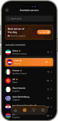
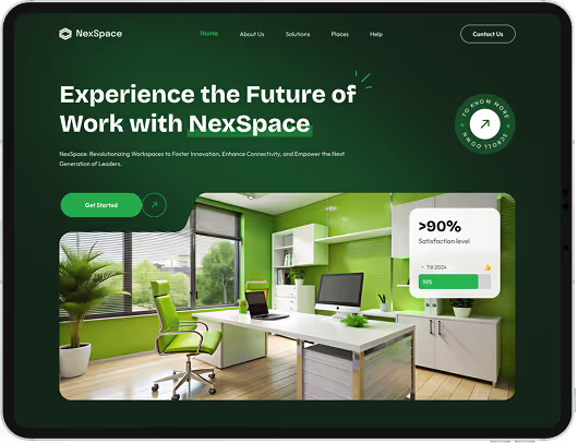
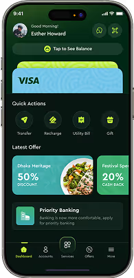

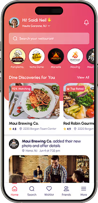
Designing the visual layer of a product as a system — type scale, color, spacing, components and their states, responsive behavior, and the documentation and tokens needed to build it faithfully.
They overlap heavily for websites. Web design usually means designing a site end to end; UI design means building the component system underneath, which matters more when the product is an application or will keep growing.
Yes — hover, focus, active, disabled, loading, error and empty. Undesigned states are decided by whoever implements them, which is where "it looks different from the design" comes from.
Yes. Where brand guidelines exist, the UI system is built from them. Where they conflict with usability requirements — contrast being the usual one — we flag it and propose an accessible variant rather than quietly ignoring the guideline.
Figma, with components, variants and variables set up so the file is a working system rather than a set of static frames. Handoff includes exported tokens.
Yes. Named variables for color, type, spacing, radius and elevation, exported in a form your developers can implement directly. This is what makes a build match a design rather than approximate it.
Sometimes. For a single small site designed once, foundations plus the components that site needs is enough. A full system is worth it when multiple people will make design decisions or the product will keep expanding.
Contrast ratios validated as palettes are chosen, visible focus indicators on every interactive element, adequate target sizes, and layouts that survive text scaling. Designing these in is far cheaper than remediating them later.
Still deciding if ui design services is right for you?
Talk to UsEvery inconsistent interface was built by people trying to be consistent. Nobody sets out to ship four button styles. They arrive one at a time, each for a defensible reason, over a period long enough that no single decision looked like a mistake.
A new section needs a slightly different card. A campaign page needs a heavier heading. A form needs a wider input than the existing one. Each is reasonable in isolation, and after a year the product has three of everything and no way to say which is correct.
This is not fixed by asking people to be more careful. It is fixed by having a system that makes the consistent choice the easy one — named tokens instead of raw values, components with their states already decided, and documentation that answers "which one do I use" without a meeting.
That is what we build. Not a set of screens that look right on the day they are delivered, but a system that still looks right after two years of other people working on it.
Tell us what you are building and who will maintain it. We will tell you how much system you actually need — and where a smaller scope would serve you better.