
Built for Application
Designed against the things you actually produce — website, proposal, invoice, social post — not abstract mood boards.
A logo is one mark. Brand identity design is the system around it — palette, typography, imagery, layout and voice — plus guidelines specific enough that the next person applying it gets the same result. Visual brand identity work is what makes a website, a document and a social post recognizably the same company. Just the mark? That is logo design.
Most identity work fails at application, not at concept. The system looked coherent in the presentation and nobody could reproduce it afterwards.
Designed against the things you actually produce — website, proposal, invoice, social post — not abstract mood boards.
Specific values and constraints, not adjectives. "Modern and approachable" is not a specification.
Palettes validated for contrast, so the identity does not force a choice between brand and legibility.
Screen is where most people meet you. The system is built for it and extended to print, not the reverse.
Source files, tokens and templates. No dependency on us to use your own identity.
An identity is judged by whether people can apply it without asking, months after the project ended. These checks aim at exactly that.
These are system checks. We make no claim about brand recall, preference or commercial impact — those would need measurement we have not done.
Five parts. A logo is one of them, and rarely the one causing inconsistency.
Start a Project →Logo and its variants across every context.
Color and typography, defined as usable values.
Photography and illustration direction.
How the brand sounds in writing.
A complete system plus the applications that prove it works.
What the business does, who it is for and what it can credibly claim that competitors cannot — the input the whole identity is built from.
Primary, stacked, horizontal, icon-only and single-color versions, tested at every size they will appear at.
Primary, secondary and functional colors with exact values, usage rules and contrast validated for accessible text.
Typefaces and a working scale for headings, body and interface, licensed for the uses you actually need including web.
Photography and illustration style defined specifically enough to brief someone else, with examples of what is and is not on brand.
How the brand writes — vocabulary, tone, what it avoids — with real before-and-after examples rather than abstract adjectives.
The system applied to real things: website, proposal, email, social templates, stationery. This is where gaps in a system surface and get fixed.
Documentation written to be used, plus source files, exports and design tokens ready for web design and development.
If the strategy underneath is not settled, [brand strategy](/services/logo-branding/brand-strategy/) comes first. If you have an existing brand with equity to protect, that is [rebranding](/services/logo-branding/rebranding/).
The right scope depends entirely on what your organization actually makes, which is usually broader than a brand project assumes.
Interface components, email, social and app surfaces. Print rules matter less than dark-mode behavior.
Packaging, labelling and regulatory information that has to coexist with the design rather than fight it.
Proposals, reports and presentations produced by non-designers in ordinary office software.
Physical environments, signage and staff-facing materials, where the identity is experienced in three dimensions.
A parent and several children, where the rules about relationships matter more than any single mark.
Campaign templates built weekly by a team, where a component library saves more than a style guide does.
Positioning, then system, then application — with application treated as part of the design rather than as a delivery step.
The business, its audience and its competitive context. Identity built without this is decoration with no argument behind it.
A small number of genuinely different territories, developed far enough to judge fairly and checked against real applications early.
Marks, palette, type, imagery and voice defined as usable specifications rather than as a look.
The system used on the things you actually produce. Gaps appear here — and get resolved here rather than after handover.
Guidelines, source files, exports and tokens, written so someone who was not in the project can apply the brand correctly.
Identity sits between a logo and a strategy. Choosing the wrong one of the three is the most common way this budget gets wasted.
Every document looks different because everyone is improvising. A system fixes this; a new logo does not.
More people making things, none of whom were in the original design conversation.
The strategy is settled and the visual expression has not caught up with it.
The most efficient sequence — a design system inherits from an identity rather than inventing one alongside it.
If the question is what you stand for rather than what you look like, brand strategy has to be settled before any of this can be decided.
Identity work usually fails after delivery, in the hands of people who were not in the room.
A logo is a mark. A brand identity is the whole system — palette, typography, imagery, layout, voice — plus the rules for using them consistently.
This distinction is worth settling before commissioning anything, because they are different purchases at different scales. A logo project delivers a mark and its variants. An identity project delivers everything needed to make a website, a document and a social post feel like the same company.
A logo alone is genuinely enough for many businesses, particularly early on. The problem is commissioning a mark and then expecting identity-level consistency from it — which is where most disappointment in this category comes from.
Because most of them are written to be admired rather than used. A hundred-page document with mood photography and adjectives gives someone building a slide deck nothing to act on.
What people actually need at the moment of use is specific: exact color values and where each is allowed, the type scale with sizes, spacing rules, minimum logo sizes and clear space, and examples of what wrong looks like. Those answer the question being asked.
The other failure is not covering real cases. Guidelines that show a business card and a billboard, when the company mostly produces proposals, invoices and social posts, leave everyone improvising on the things they make daily.
More than most identity projects treat it. Customers read far more of your words than they look at your logo, and inconsistent voice is more noticeable than inconsistent color.
The problem is that voice is usually documented as adjectives — friendly, professional, approachable — which every company claims and nobody can act on. Two writers given those words will produce different results and both will believe they complied.
What works is showing rather than describing: specific vocabulary the brand uses and avoids, sentence-level examples of the same message written on and off brand, and rules about things like contractions, jargon and how you talk about competitors. That is usable; adjectives are not.
Digital first for nearly every business now, then extended to print. Most people encounter a brand on a screen, frequently a phone, before they see anything printed.
That reverses some traditional decisions. Palettes need contrast that works for on-screen text, not just in a printed brochure. Typefaces need genuine web licensing and must render well at interface sizes. Logos need to work as a favicon and an app icon, not just on a letterhead.
Print-first identities routinely fail at exactly those points, and the fix is usually a compromised digital version alongside the "real" one. Designing digital-first avoids maintaining two brands.
Because they answer questions nobody has and skip the ones people actually face. A document opening with the philosophy behind the mark, and never saying which blue to use for a button, will be closed and not reopened.
The second reason is access. Guidelines in a large document on somebody's drive, with the assets somewhere else, lose to whatever version of the logo is easiest to find. Convenience beats correctness every time.
The third is incompleteness. Guidelines cover the things designers enjoy specifying and omit the things people actually produce — a spreadsheet, a slide deck, an internal notice. Faced with no guidance, people improvise, and the improvisation becomes the standard.
What works is short, specific, close to the assets, and organized by task rather than by design element. "Making a presentation" is how someone arrives; "typographic hierarchy" is not.
More than most identity projects budget for, because it is the part of the brand people encounter most often. Visitors read considerably more of your words than they study your logo.
Voice work fails when it produces adjectives. "Friendly, professional and innovative" describes almost every organization and guides nobody. It cannot be applied to a sentence.
What works is contrast and examples. This, not that — with real before-and-after pairs from your own materials. A writer can apply that immediately; they cannot apply an adjective.
The places it matters most are the least glamorous: error messages, confirmation emails, form labels and the things support says every day. Those are where people form an impression of what an organization is like to deal with, and they are almost always written by someone who never saw the brand document.
Around roles rather than around a favorite set of colors, and with contrast checked before anything is approved.
A working palette needs a primary, at least one accent, a neutral range with several steps, and defined states for success, warning and error. Palettes with three beautiful colors and no neutrals produce interfaces where nobody knows what to use for body text.
Contrast has to be verified during selection. A brand color that fails against white is not usable for text, and discovering that after it has been applied across a hundred components is an expensive correction. It is arithmetic and takes minutes.
Dark backgrounds need their own decisions rather than an inversion. A color that reads well on white often glares or muddies on dark, and defining the dark-context values deliberately is what stops each team inventing their own.
A system somebody can use without you, which is a different thing from a set of attractive artwork.
Concretely: the logo system with its lockups and rules, a palette with defined roles and contrast-checked pairings, a type system with licensed fonts and a working scale, layout principles expressed as reusable structures, and templates for the things you produce most.
The templates are the part most often cut and most often missed afterwards. A branded proposal template, a slide layout and an email structure do more day-to-day work than the guidelines document, because they are where the brand is actually applied.
And it delivers governance — who owns the assets, where they live, who decides on cases the rules do not cover. Without that, an identity degrades from the day the project ends, however good the design was.
Through ownership and templates, not through a document. Every identity degrades from the day the project ends unless somebody is responsible for it.
The single most effective measure is templates for the things you actually produce — a proposal, a slide deck, a social post, an email. Those are where the brand is applied daily, and if they do not exist people build their own.
The second is a single place the assets live, reachable by everyone who needs them without asking. Convenience decides which logo file gets used far more reliably than any guideline does.
The third is a named owner for cases the rules do not cover, which will arise within weeks. Without one, every new situation is resolved by whoever is doing it, and those resolutions accumulate into a second, undocumented identity.
And a periodic review, because businesses change. A palette that never accounted for dark interfaces, or a type system chosen before a font license lapsed, needs updating rather than working around.
As direction rather than as a set of approved images, because the images will run out and the direction has to survive that.
What an identity needs to define is the character: how people are shown, whether images are candid or composed, what the treatment is, and what is never used. That is applicable to a photograph nobody has taken yet.
Stock imagery is where most identities visibly fail. Generic business photography undermines whatever the rest of the identity is claiming, and it is recognizable as stock to almost everyone.
Where budget does not support commissioned photography, the honest answer is often to use less of it. Illustration, typography or a strong graphic system can carry an identity without pretending to a photographic library that does not exist.
And there need to be technical specifications alongside the creative ones — dimensions, crops, formats and file sizes. A beautifully directed image library delivered as uncompressed files becomes a performance problem the moment it reaches a website.

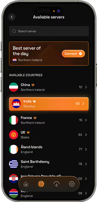
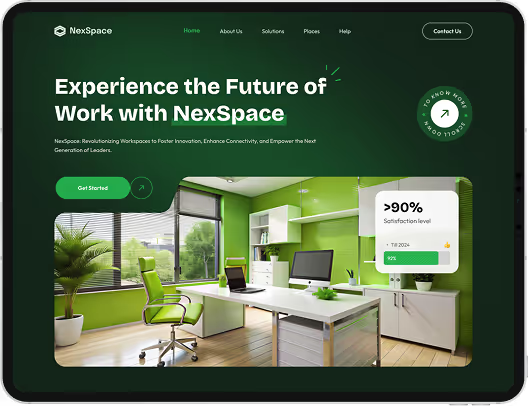
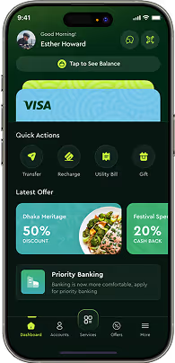
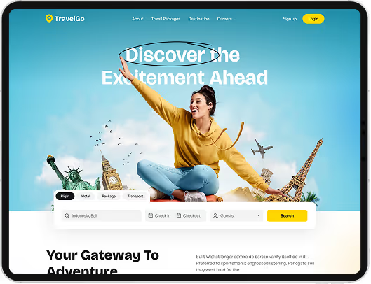
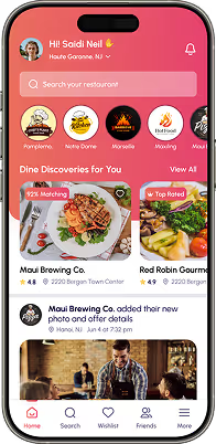
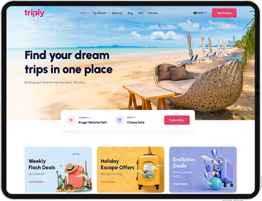
Designing the complete visual and verbal system a brand runs on — logo and its variants, color palette, typography, imagery direction and voice — plus the guidelines and assets needed to apply it consistently.
A logo project delivers a mark and its variants. Identity delivers the whole system around it. Many businesses genuinely only need the logo; the mistake is expecting system-level consistency from a mark alone.
If positioning is unsettled, yes — identity built on an unclear strategy looks arbitrary because it is. Brand strategy covers that, and where positioning is already clear we start from it.
Logo system with all variants, color palette with exact values and usage rules, typography system and scale, imagery direction, voice guidance with examples, real applications, plus guidelines, source files and design tokens.
It is designed digital-first, with contrast validated for on-screen text, web-licensed typefaces and design tokens handed over ready for web design and development.
It depends on scope and how quickly decisions and feedback arrive. Feedback speed is usually what sets the timeline. We agree a schedule at the start.
Yes. Source files, exports, tokens and rights transfer on completion. You should never need to come back to us to use or extend your own brand.
Then the identity can be built around it. Plenty of projects keep an existing mark that works and build the missing system — palette, type, imagery, voice — around it.
Still deciding if brand identity design is right for you?
Talk to UsBrand identity projects end with a presentation, and presentations are where identities look their best. Every application is designed by the people who made the system, using content chosen to suit it, with no deadline pressure and no awkward requirement anyone forgot to mention.
The identity that matters is the one that exists eighteen months later, applied by a new marketing hire to a proposal template, at four in the afternoon, using guidelines they skimmed once. Whether it holds up depends almost entirely on whether that person could find the answer they needed in under a minute.
Which means the guidelines are not documentation of the design work. They are the design work — the part that determines whether the system survives contact with the organization.
So we write them to be used at the moment of use, and we test the system on the things you actually produce before anyone signs it off.
Tell us what you produce and who applies the brand. We will tell you what the system needs to cover — and whether a logo project would serve you better.