
Platform Native
iOS and Android have different navigation, gestures and system components. We design to each rather than averaging them.
An app that ignores platform convention feels wrong before anyone can say why. Mobile app UI UX design means working within iOS Human Interface Guidelines and Material Design rather than porting a website into a phone-shaped frame — navigation patterns, gestures, system components and the states a mobile app spends most of its time in.
The most common app design failure is a web layout scaled down, with none of the conventions users already know.
iOS and Android have different navigation, gestures and system components. We design to each rather than averaging them.
Primary actions placed where thumbs actually reach on the devices people hold one-handed.
Apps lose connection. Designs that assume they will not fail in the real world.
Checked on real hardware, not just in a desktop preview at a comfortable zoom.
Handoff written for mobile developers — states, gestures, transitions and safe areas.
Apps are used in conditions a desktop mockup cannot represent. These checks happen on real devices, in real hands.
These are design checks. Store ratings, retention and install figures are measured in your own app analytics; we publish none.
Four constraints a website does not have. Each one changes what a good design looks like.
Discuss Your App →Users already know how their OS behaves. Fighting that costs you.
Swipe, long press, pull to refresh — interactions with no web equivalent.
Offline, slow and interrupted are normal states, not edge cases.
Screen sizes, notches, safe areas, and one-handed use.
Structure, visual system and platform-specific specification.
Navigation model chosen deliberately — tabs, stack, drawer — with the full task flows including onboarding, permissions and account states.
Clickable prototypes tested on a real device, because a flow that works on a laptop can be unusable in one hand on a phone.
Designed to Human Interface Guidelines — native navigation patterns, system components, and behavior iOS users already expect.
Designed to Material Design — its own navigation, component set and interaction conventions, not an iOS design recoloured.
A mobile component library with all states, sized for touch and specified across the device range you support.
What the app shows with no connection, a failed request, an empty list or an interrupted action. These are frequent states in mobile, not rare ones.
Dynamic type support, VoiceOver and TalkBack behavior, contrast and target sizes designed in.
Specs for mobile developers including safe areas, gesture behavior, transitions and per-platform differences.
How often and in what circumstances an app is opened changes almost every design decision inside it.
Opened without thinking. Speed to the main action matters more than anything, and onboarding is a one-time cost.
Opened when needed and forgotten between. Everything must be re-learnable instantly, because it will be.
Bright sunlight, gloves, poor connection, one hand. Contrast, target size and offline behavior stop being refinements.
Where a task is completed and the app closed. Efficiency and clear confirmation carry the experience.
Long sessions where reading comfort, scroll behavior and interruption recovery decide whether people stay.
Supporting a physical product or a website. Scope discipline matters — trying to do everything the web version does is the usual mistake.
Flows on device early, platform decisions made explicitly rather than by default.
What the app is for, used how often, in what situation. An app used briefly while standing needs different design from one used at a desk.
Tabs, stack or drawer — decided against the actual task structure, because changing it later means redesigning every screen.
Flows tested in the hand, on real hardware. Reach, thumb travel and one-handed use only reveal themselves there.
iOS and Android designed to their own conventions, sharing the brand and the structure but not the component behavior.
States, gestures, transitions, safe areas and platform differences documented for the developers building it.
Most businesses that want an app would be better served by a good mobile website. These are the exceptions.
People will open it regularly. An icon on a home screen earns its place through frequency, not through wanting one.
Camera, location in the background, offline storage or hardware access that a browser cannot provide adequately.
Staff working where connectivity is unreliable and a web app would simply stop.
Where timely notifications are the product rather than a marketing channel bolted onto it.
Occasional use, no device capability needed, discovery through search — a fast mobile-first website will reach more people at a fraction of the cost.
Users cannot usually explain why an app feels off. The causes are consistent and mostly avoidable.
They should share brand and structure, not component behavior. Forcing pixel-identical apps across both platforms means at least one of them fights conventions its users already know.
The differences that matter are concrete: navigation patterns and where back lives, system components like pickers and sheets, typography defaults, and how gestures behave. Users are not consciously aware of these until something violates them, at which point the app feels subtly broken.
The practical answer is one design language, two implementations of the platform layer. Your brand stays consistent; navigation and system interactions follow each platform.
Usually because it is one — either literally a wrapped web view, or a design produced by scaling web layouts to phone width without rethinking interaction.
The tells are recognizable. Navigation that lives in a top bar rather than where the platform puts it. No gesture support, so back only works via an on-screen button. Hover-dependent affordances that do nothing on touch. Scroll behavior that does not match the OS. Long forms designed for a keyboard and mouse.
Fixing it is not a styling pass. It means revisiting the navigation model, the interaction patterns and often the task structure — which is why we start there rather than at the visual layer.
By treating them as normal states rather than errors. Mobile apps run on trains, in basements and on congested networks, and an app that only works on good wifi will be judged on the times it did not.
What that means in design: showing cached content with a clear indication it may be stale, queueing actions taken offline and confirming when they sync, distinguishing "loading" from "failed" clearly, and never losing input a user has typed because a request failed.
The last one causes the most damage. An app that discards a half-completed form when the connection drops teaches users not to trust it with anything long — and that lesson is very hard to un-teach.
More than web design does, because platform behavior is easy to specify and easy to lose. Gestures, transitions, safe area handling and system component usage all get approximated if the handoff does not state them.
Native, React Native and Flutter each change what is straightforward to implement, so the build approach is worth knowing before design is finalized. A transition that is trivial in one is awkward in another.
This is why our handoff is written for mobile developers specifically — per-platform component differences, gesture behavior, transition specs and safe area treatment. A design that assumes the developer will infer these produces an app that is close to the design and does not feel like it.
Closely for navigation and system behavior, freely for everything that is distinctly yours.
The reason is not purity. It is that people have learned their phone, and every departure from what they expect costs them a moment of confusion. A back gesture that does not work, a control that looks like a system one and behaves differently — those are small individually and corrosive together.
Both platforms publish detailed guidance, and both app stores apply some of it during review. Ignoring it risks rejection as well as confusion, which turns a design preference into a schedule risk.
Where brand belongs is in typography, color, imagery, tone and the parts of the experience that are actually yours. That is more than enough room to be distinctive without redesigning the parts of the phone people already know.
They should feel like the same product and behave like native apps on each platform. Identical is a goal that serves the design team rather than either set of users.
The differences that matter are structural — where navigation sits, how back works, what a share action looks like, how dates and pickers behave. Forcing one platform's pattern onto the other produces an app that feels subtly wrong to half its users without anyone being able to name why.
What should be identical is everything that carries your brand and your content. Colors, type, imagery, tone, information architecture and the sequence of a task should not vary by platform.
The practical approach is one design system with platform-specific components. Shared tokens, shared content, shared flows; navigation and system controls native to each. It costs more than designing once and considerably less than designing twice.
By treating a bad connection as a normal state rather than an error, because for many users in many places it is the usual condition.
The first decision is what works offline. Content already fetched should remain readable. Actions taken offline should queue and sync rather than failing, and the interface should say clearly that this has happened rather than pretending everything is fine.
Loading states need to distinguish between slow and broken. A spinner that runs forever tells a user nothing; a message that says it is taking longer than usual, with a way to retry, respects them. And placeholders that reserve the right space prevent the layout jumping when content finally arrives.
The hardest case is a partial failure — some data loaded, some not. Designing for it means deciding, per screen, what is essential and what can be absent, so the screen degrades usefully instead of showing an error over content that was perfectly fine.
Get someone to the first useful moment as quickly as possible, and nothing else.
Most onboarding is designed backwards — a tour of features before anyone has a reason to care, or an account demanded before any value has been shown. Both ask for commitment in exchange for a promise, at the point where the person has the least trust they will ever have.
The better pattern is to let people do something real first. Delay the account until it is genuinely needed — to save something, to sync something — at which point it is obviously worth it rather than an obstacle.
Permissions follow the same logic. A location request on first launch, before context exists, gets declined and is then difficult to recover. Asked at the moment it is obviously needed, it gets granted. The timing is a design decision with a direct, measurable consequence.
Enough that designing without them produces work that gets quietly reinterpreted during the build.
Every platform has things that are cheap and things that are expensive. A custom transition that looks trivial in a prototype may be days of work; a standard component with a slightly different appearance may be minutes. A designer who does not know which is which spends the budget in the wrong places.
The other dependency is state. Applications have far more states than websites — loading, empty, error, offline, permission denied, partially synced. Developers know which ones will occur in practice, and the ones nobody designs get built as whatever was quickest.
The arrangement that works is designers and developers reviewing together early and often, with the design system implemented as real components rather than delivered as a document. It removes the interpretation step, which is where most of the drift happens.
More than most projects plan for, and the requirements are published rather than mysterious.
Both stores review submissions against guidelines that include interface expectations, and rejections for design reasons are routine rather than exceptional. Reading the relevant guidance before designing is considerably cheaper than after a rejection.
The store listing itself is a design deliverable that is frequently forgotten — icon, screenshots and preview video are what decide whether anyone installs, and they are produced at the end under time pressure more often than not.
The icon carries the most weight and has the tightest constraints. It appears at small sizes among many others, it cannot rely on text, and it needs to be recognizable at a glance on a crowded home screen.
Screenshots are the second, and they are marketing rather than documentation. Showing the most valuable screens with a clear caption does more than showing the app in order, which is how most listings are assembled.

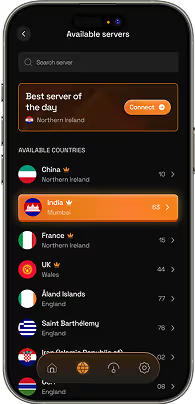
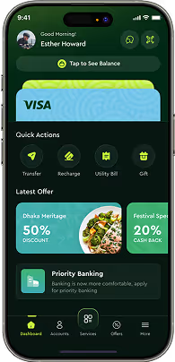

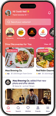
Designing both the structure and visual layer of a mobile app — navigation model, task flows, component system, states and platform-specific behavior for iOS and Android, specified so developers can build it faithfully.
Yes, to each platform's own conventions. They share brand and structure but not component behavior — Human Interface Guidelines and Material Design differ in navigation, system components and interaction patterns.
Yes. Existing apps have real usage data and real reviews, which makes diagnosing what is failing considerably faster than designing from nothing.
App development is not a service we currently offer. We design and specify, and work alongside your development team. For web-based products, web application development is available.
Responsive web adapts one interface to different widths. App design works within platform conventions, gestures, offline states and device constraints that have no web equivalent — different navigation models, different interaction vocabulary.
Flows, wireframes, a tested prototype, full visual designs per platform, a component library with all states, and a developer specification covering gestures, transitions, safe areas and platform differences.
Yes. Reach, thumb travel, one-handed use and how a layout behaves with the system keyboard up only reveal themselves on hardware. A prototype that works on a laptop can be unusable in the hand.
It depends on the number of core flows and whether both platforms are in scope from the start. We scope per project rather than quoting a figure that would not apply to yours.
Still deciding if mobile app ui ux design is right for you?
Talk to UsNobody opens an app and consciously admires its navigation pattern. Platform conventions are invisible when followed — that is the whole point of them. Years of using a phone have taught people where back lives, what a swipe does, how a sheet behaves, and none of that knowledge is available to introspection.
Break one and the reaction is immediate but unspecific. The app feels cheap. It feels slow, even when it is not. Something is wrong and the user cannot tell you what. They just use it less.
This is why app design is not web design at a smaller size. The constraints are different, the interaction vocabulary is different, and a decision that is neutral on the web — putting navigation in a top bar, for instance — reads as foreign on a phone.
Working inside those conventions is not a limit on originality. It just means the parts users already understand are left alone, so the parts that are genuinely yours are the ones they notice.
Describe the core task and who performs it. We will tell you what the design needs to cover — and where the platform conventions will do work for you.